运用 CSS 网格打造引人入胜的杂志风格布局
CSS 赋予我们极大的自由度,能够设计出引人注目的、响应式的页面布局。杂志风格布局通过引人注目的方式组织文字和图片内容,使其成为一种受欢迎的选择。
CSS 网格为实现此类布局提供了必要的工具和精细的控制,因此这是一项值得深入学习的卓越技术。
什么是杂志风格布局?
杂志风格布局利用类似网格的结构,按列和行排列内容。
它们非常适合以结构清晰且视觉上吸引人的方式展示各种类型的内容,例如文章、图片和广告。
理解 CSS 网格
CSS 网格是一种强大的布局工具,使您能够在二维空间中精确定位元素,从而轻松创建列和行。
在这种类型的布局中,有两个关键组成部分:网格容器(负责定义网格的结构)和网格项(容器的子元素)。
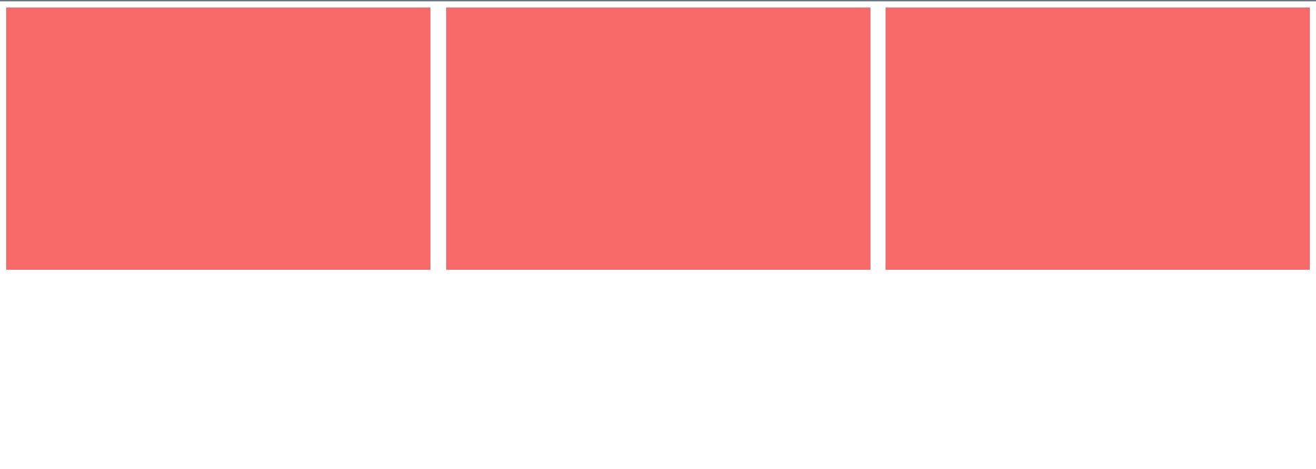
以下是如何使用 CSS 网格创建 3×3 网格的简单示例:
 .grid-container {
    display: grid;
    grid-template-columns: repeat(3, 1fr);
    gap: 20px;
}.grid-item {
    background-color: #f76a6a;
    padding: 20px;
}
这段代码定义了一个网格容器,它具有三列等宽的列,项目之间的间距为 20 像素。效果如下:
设置 HTML 结构
为了实现杂志风格的布局,你需要一个结构良好的 HTML 文档。 考虑使用语义化元素来组织内容,例如 <article> 和 <section>。以下是一个良好的起点:
<body>
<section class="magazine-layout">
<article>
<img src="https://source.unsplash.com/random/?city,night" />
<p>文章标题</p>
</article><article>
<img src="https://source.unsplash.com/random/?city,day" />
<p>文章标题</p>
</article><article>
<img src="https://source.unsplash.com/random/?animal" />
<p>文章标题</p>
</article><article>
<img src="https://source.unsplash.com/random/?book" />
<p>文章标题</p>
</article><article>
<img src="https://source.unsplash.com/random/?food" />
<p>文章标题</p>
</article>
</section>
</body>
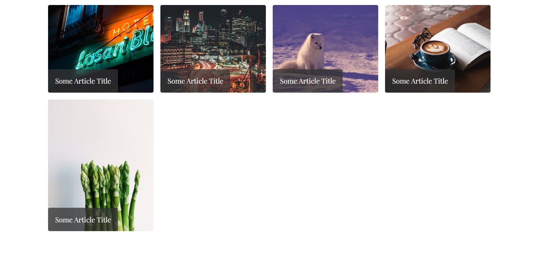
定义网格容器
要为杂志风格布局创建网格,请添加以下 CSS 代码:
 .magazine-layout {
    height: 100%;
    max-width: 130rem;
    margin: 0 auto;
    display: grid;
    grid-template-columns: repeat(auto-fit, minmax(250px, 1fr));
    grid-template-rows: repeat(auto-fit, minmax(250px, 1fr));
    gap: 2rem;
    padding: 2rem;
}
这段 CSS 代码指定容器元素 .magazine-layout 为网格容器,通过声明 display: grid 实现。
grid-template-columns 和 grid-template-rows 属性使用了 repeat、auto-fit 和 minmax 的组合。 这确保了列宽和行高至少为 250 像素,并且在每个列中可以容纳尽可能多的项目。
放置网格项目
现在,为每篇文章及其内容设置样式,创建引人注目的缩略图风格元素:
article {
overflow: hidden;
border-radius: 0.5rem;
position: relative;
color: #fff;
}.article img {
width: 100%;
height: 100%;
object-fit: cover;
display: block;
max-height: 400px;
}
.article p {
position: absolute;
bottom: 0;
left: 0;
padding: 2rem;
background: #333333c1;
font-size: 2rem;
border-radius: 0.5rem;
}
此时,你的页面应该看起来像这样:
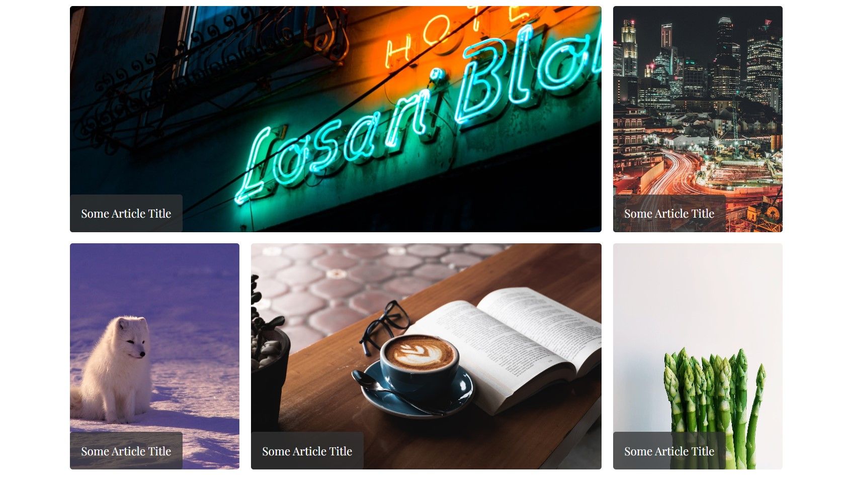
创建杂志风格布局
为了实现真正的杂志风格外观,请添加 CSS 样式,以任意想要的顺序跨越文章元素:
 .article:nth-child(1) {
    grid-column: 1 / span 3;
}.article:nth-child(4) {
    grid-column: 2 / span 2;
}
现在你的页面应该看起来像这样:
使用 CSS 网格进行响应式设计
CSS 网格的优势之一在于其固有的响应性。你可以使用媒体查询来针对不同的屏幕尺寸调整布局。例如:
@media screen and (max-width: 1100px) {
.article:nth-child(3) {
grid-column: 2 / span 2;
}.article:nth-child(5) {
grid-row: 3 / span 1;
}
}
@media screen and (max-width: 600px) {
.article:nth-child(2),
.article:nth-child(3),
.article:nth-child(4),
.article:nth-child(5) {
grid-column: 1 / span 3;
}
}
这些媒体查询在多个布局定义之间切换,以最佳适配设备屏幕尺寸。你的最终布局将适应不同的尺寸:
使用 CSS 网格转变你的布局
CSS 网格是一种灵活的工具,它可以用于创建能够适应各种屏幕尺寸的杂志风格布局。它允许你定义网格结构、放置项目和调整布局。
大胆尝试不同的网格配置和样式,为你的网站实现完美的杂志风格布局。