你是否曾想过将所有 UI 组件集中管理在 React 项目中?
如果你是 React 新手,可能还没有尝试过这种做法。
这是什么意思呢?
可以参考 react-beautiful-dnd 的示例。
示例中展示的内容被称为“故事”。 用于创建这些故事的工具则称为 Storybook。
现在你应该明白本文要讨论的内容了。 让我们立刻开始探索吧!
什么是 Storybook?
Storybook 是一个用户界面隔离的开发环境,它为你的组件提供了一个“游乐场”。 你可以在不运行主应用程序的情况下,以多种方式测试和使用你的组件。 你可以通过设置端口来运行 Storybook。
它不仅限于 React。 Storybook 可以与大多数前端框架一起使用,例如 Vue、Angular、Mithril、Marko 和 Svelte 等。
你可以从这里了解更多关于 Storybook 的信息。
什么是“故事”?
“故事”定义了组件的渲染状态。 如果我们使用一个通用组件,我们可以通过不同的 props 来使用它。 我们可以为每个状态编写一个“故事”。
假设我们有一个 Button 组件。
一个按钮可以有多种状态,例如禁用状态、加载状态、主要按钮、次要按钮、小型按钮、大型按钮和中型按钮。如果我们要列出所有状态,那么教程的进展将会非常困难。 相信你已经理解了。当你开始使用 Storybook 时,你会接触到更多这样的概念。
你可以看到按钮在不同情况下的“故事”(例如,大型、中型和小型)。
在项目中设置 Storybook
我们将在一个 React 项目中设置 Storybook。
开始吧!
- 使用以下命令创建一个 React 项目。 你可以随意命名:
npx create-react-app storybook-demo- 现在,使用以下命令在你的项目中安装 Storybook:
npx sb init这样就完成了 Storybook 的设置。
Storybook 会为我们提供一个单独的服务器。
如何启动呢?
Storybook 会自动在我们的脚本文件中添加一个命令。 你可以在 `package.json` 文件中的 `scripts` 部分看到它。 现在,运行以下命令来启动 Storybook 服务器:
npm run storybookStorybook 将使用 `package.json` 文件 `scripts` 部分中指定的端口启动一个新服务器。 它会自动在你的默认浏览器中打开 Storybook(与 React 服务器的行为相同)。
默认情况下,你会在其中看到一些不同的“故事”。 如果你不需要它们,或者想保留它们作为参考,你可以删除它们。 正如我们在上一节中讨论的那样,一个按钮可以有多种状态,你可以在 Storybook 中看到它们(但并非所有状态都被展示)。 我们将在本教程的最后部分为按钮编写更多的“故事”。
探索 Storybook 的各个部分,并熟悉不同的功能。 我们将在本教程中介绍其中的一些。
让我们开始编写我们的第一个“故事”吧!
测试 Storybook
我们已经看到了 Storybook 的运行以及一些示例。
- 在 `src` 文件夹中创建一个名为 `Button` 的文件夹。
- 创建名为 `Button.jsx`、`Button.css` 和 `constants.js` 的文件。
- 将以下代码片段中的相应代码放入文件中。
Button.jsx
import React, { Component } from "react";
import PropTypes from "prop-types";
import "./Button.css";
import { buttonTypes, buttonVariants, buttonSizes } from "./constants";

class Button extends Component {
    static defaultProps = {
        isDisabled: false,
        type: "filled",
        variant: "oval",
        size: "medium",
        backgroundColor: "#1ea7fd",
        textColor: "#ffffff",
    };

    static buttonTypes = buttonTypes;
    static buttonVariants = buttonVariants;
    static buttonSizes = buttonSizes;

    renderButton = () => {
        const {
            text,
            isDisabled,
            type,
            variant,
            size,
            backgroundColor,
            textColor,
            onClick,
        } = this.props;
        return (
            <button
                onClick={onClick}
                className={`default ${variant} ${size} ${
                    isDisabled ? "disabled" : ""
                }`}
                style={
                    type === buttonTypes.outline
                        ? {
                              border: `1px solid ${backgroundColor}`,
                              color: "#000000",
                              backgroundColor: "transparent",
                          }
                        : {
                              backgroundColor: `${backgroundColor}`,
                              border: `1px solid ${backgroundColor}`,
                              color: textColor,
                          }
                }
                disabled={isDisabled}
            >
                {text}
            </button>
        );
    };

    render() {
        return this.renderButton();
    }
}

Button.propTypes = {
    text: PropTypes.string,
    isDisabled: PropTypes.bool,
    type: PropTypes.oneOf([buttonTypes.outline, buttonTypes.filled]),
    variant: PropTypes.oneOf([buttonVariants.oval, buttonVariants.rectangular]),
    size: PropTypes.oneOf([
        buttonSizes.small,
        buttonSizes.medium,
        buttonSizes.large,
    ]),
    backgroundColor: PropTypes.string,
    textColor: PropTypes.string,
    onClick: PropTypes.func,
};

export { Button };
Button.css
.default {
    border: none;
    cursor: pointer;
    background-color: transparent;
}

.default:focus {
    outline: none;
}

.disabled {
    opacity: 0.75;
    cursor: not-allowed;
}
.small {
    font-size: 12px;
    padding: 4px 8px;
}

.medium {
    font-size: 14px;
    padding: 8px 12px;
}

.large {
    font-size: 16px;
    padding: 12px 16px;
}

.oval {
    border-radius: 4px;
}

.rectangular {
    border-radius: 0;
}
constants.js
export const buttonTypes = {
    outline: "outline",
    filled: "filled",
};

export const buttonVariants = {
    oval: "oval",
    rectangular: "rectangular",
};

export const buttonSizes = {
    small: "small",
    medium: "medium",
    large: "large",
};
这段代码是做什么的呢?
我们已经编写了一个通用的 Button 组件,它可以通过不同的方式使用。现在,我们有一个可以拥有多种状态的组件。
让我们按照以下步骤编写我们的第一个“故事”:
- 创建一个名为 `Button.stories.jsx` 的文件。
- 将 React 和我们的 Button 组件导入到文件中。
- 现在,为我们的组件“故事”定义一个标题或路径。 我们将使用以下代码定义它:
export default {
   title: ‘common/Button’,
}
上面的代码会将当前文件中的所有“故事”放置在 `common/Button/` 目录中。
- 导出一个带有强制属性的按钮,如下所示:
export const defaultButton = () => (
    <Button text=”Default Button” onClick={() => {}} />
);
我们的第一个“故事”就完成了! 使用以下命令运行 Storybook 并查看输出:
npm run storybook我们会编写更多的“故事”,请不要担心。
它在前端开发中有什么用?
使用 Storybook 的主要优点是什么?
假设我们一个 10 人的团队一起工作。 我们需要检查每个人为当前项目编写的公共组件。
我们该如何做?
我们必须逐个检查每个公共组件。 但是,这非常耗时,并不是我们首选的方式。 这时我们的新朋友 Storybook 就派上用场了。
我们如何利用它来解决这个问题呢?
我们可以使用 Storybook 为公共组件(任何 UI 组件)编写“故事”。 每当你的队友想检查其他人的公共组件时,他们只需运行 Storybook 服务器,就可以看到所有的 UI 组件,就像我们上面看到的那样。
我们还可以使用 Storybook 中的渲染组件做更多的事情。 Storybook 有一个叫做“Addons”的概念,它为我们的“故事”赋予了强大的功能。
假设我们必须检查 Storybook 中 UI 组件的响应式,我们可以在 Storybook 中使用名为 Viewport 的插件。 我们将在接下来的部分中了解关于插件的更多信息。
使用 Storybook
在本节中,我们将编写不同的“故事”来定义我们常用组件 Button 的不同状态。
编写“故事”并不困难。“故事”定义了组件的状态。如果你查看组件的 props,你就会很容易理解组件的不同用例。
让我们通过提供可选的 props 来编写一些“故事”:
export const largeButton = () => (
    <Button text="Large Button" onClick={() => {}} size="large" />
);
export const outlineSmallButton = () => (
    <Button
        text="Outline Small Button"
        onClick={() => {}}
        size="small"
        type="outline"
    />
);
export const rectangularLargeButton = () => (
    <Button
        text="Rectangular Large Button"
        onClick={() => {}}
        size="large"
        variant="rectangular"
    />
);


export const disabledButton = () => (
    <Button text="Disabled Button" onClick={() => {}} isDisabled={true} />
);


export const warningButton = () => (
    <Button
        text="Warning Button"
        onClick={() => {}}
        backgroundColor="orange"
    />
);
上面的三个“故事”定义了我们的 Button 组件的不同用例。 现在,轮到你为我们的公共组件添加一些其他的“故事”案例了。 尝试添加 `disabledSamllRectangularButton`、`dangerButton`、`successDisabledButton` 等等……
我不会为上述情况提供代码。 你必须自己编写才能理解它。 你可以看到我们到目前为止编写的完整的“故事”代码:
import React from "react";

import { Button } from "./Button";

export default {
    title: "src/common/Button",
};

export const defaultButton = () => (
    <Button text="Default Button" onClick={() => {}} />
);

export const largeButton = () => (
    <Button text="Large Button" onClick={() => {}} size="large" />
);

export const outlineSmallButton = () => (
    <Button
        text="Outline Small Button"
        onClick={() => {}}
        size="small"
        type="outline"
    />
);

export const rectangularLargeButton = () => (
    <Button
        text="Rectangular Large Button"
        onClick={() => {}}
        size="large"
        variant="rectangular"
    />
);

export const disabledButton = () => (
    <Button text="Disabled Button" onClick={() => {}} isDisabled={true} />
);

export const warningButton = () => (
    <Button
        text="Disabled Button"
        onClick={() => {}}
        backgroundColor="orange"
    />
);
现在,你已经完全掌握了为组件编写“故事”的能力。
让我们跳到下一节,我们将了解插件以及它们如何提升我们的“故事”。
Storybook 插件
默认情况下,我们会提供多个插件。 在本节中,我们将探索对我们的开发最有用的插件。
让我们提升我们的 Button “故事”。
控件
控件添加了一项功能,允许在 Storybook 本身中自定义组件的 props。 对于我们的 Button 组件,我们可以添加控件来更改 Storybook 中的不同 props。
假设我们必须找出按钮背景颜色的最佳颜色。 如果我们通过逐个给组件来检查背景颜色,这将非常耗时。 相反,我们可以添加一个控件,允许我们在 Storybook 中选择不同的颜色。 我们可以直接在 Storybook 中测试背景颜色。
让我们看看如何向我们的 Button “故事”添加控件。
首先,我们必须如下定义标题下方的所有 props:
export default {
    title: "src/common/Button",
    argTypes: {
        text: { control: "text" },
        backgroundColor: { control: "color" },
        isDisabled: { control: "boolean" },
        size: {
            control: { type: "select", options: ["small", "medium", "large"] },
        },
        type: {
            control: { type: "select", options: ["filled", "outline"] },
        },
        variant: {
            control: { type: "select", options: ["oval", "rectangular"] },
        },
    },
};
接下来,将 props 从组件中分离出来,并将它们作为 args 提供,如下所示:
export const outlineSmallButton = (args) => (
    <Button {...args} onClick={() => {}} />
);
outlineSmallButton.args = {
    text: "Outline Small Button",
    size: "small",
    type: "outline",
};
你可以在组件预览窗口的底部看到控件。
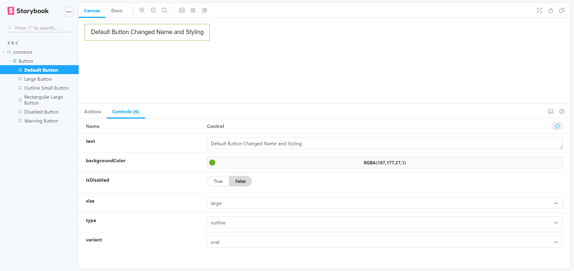
你可以在组件预览窗口的底部看到控件选项卡。 试试看吧!
如上所述更新所有“故事”。这更像是了解 Storybook 插件的语法。 在 `argTypes` 中,我们使用了不同类型的控件。 你可以从 这里找到 Storybook 中存在的所有控件。
更新后的按钮“故事”将如下所示:
import React from "react";

import { Button } from "./Button";

export default {
    title: "src/common/Button",
    argTypes: {
        text: { control: "text" },
        backgroundColor: { control: "color" },
        isDisabled: { control: "boolean" },
        size: {
            control: { type: "select", options: ["small", "medium", "large"] },
        },
        type: {
            control: { type: "select", options: ["filled", "outline"] },
        },
        variant: {
            control: { type: "select", options: ["oval", "rectangular"] },
        },
    },
};

export const defaultButton = (args) => <Button {...args} onClick={() => {}} />;
defaultButton.args = {
    text: "Default Button",
};

export const largeButton = (args) => (
    <Button {...args} onClick={() => {}} size="large" />
);
largeButton.args = {
    text: "Large Button",
};

export const outlineSmallButton = (args) => (
    <Button {...args} onClick={() => {}} />
);
outlineSmallButton.args = {
    text: "Outline Small Button",
    size: "small",
    type: "outline",
};

export const rectangularLargeButton = (args) => (
    <Button {...args} onClick={() => {}} />
);
rectangularLargeButton.args = {
    text: "Rectangular Large Button",
    size: "large",
    variant: "rectangular",
};

export const disabledButton = (args) => <Button {...args} onClick={() => {}} />;
disabledButton.args = {
    text: "Disabled Button",
    isDisabled: true,
};

export const warningButton = (args) => <Button {...args} onClick={() => {}} />;
warningButton.args = {
    text: "Warning Button",
    backgroundColor: "orange",
};
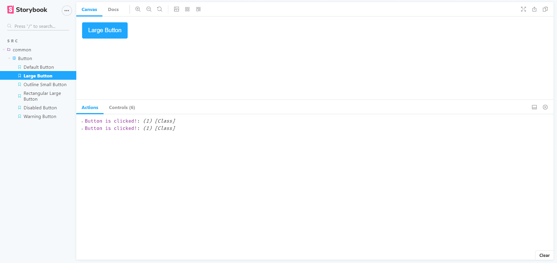
动作
动作是 JavaScript 中的事件。 我们可以点击一个按钮,它就是一个 JavaScript 事件。 我们可以使用 Actions 插件对按钮点击执行一些操作。
通过 Actions,我们可以测试事件是否正常工作。 禁用的按钮不能被点击,而启用的按钮必须是可点击的。 我们可以使用这些操作来确保这一点。
让我们看看如何为按钮点击添加动作。
我们之前已经为 `onClick` prop 提供了匿名函数。 现在,我们必须更新它。
- 使用以下语句从 Storybook 插件导入 action:
import { action } from "@storybook/addon-actions";- 将所有 `() => {}` 替换为以下语句:
action("Button is clicked!")现在,转到 Storybook 并单击一个按钮。 你将在控制选项卡旁边的动作选项卡下看到打印的消息。 如果你单击禁用的按钮,则不会打印该消息,因为它已被禁用。
我们可以对 `onChange`、`onMouseOver`、`onMouseOut` 等不同的事件使用该动作,以确保它们正常工作。 尝试为输入元素的 `onChange` 实现相同的方法。
有关 action,请参阅 文档。
背景
我们可以使用背景插件更改预览窗口的背景。 我们无需编写任何代码,只需在 Storybook 中更改即可。 你可以在下面的 gif 中看到效果。
视口
我们还可以在 Storybook 中测试组件的响应式。 请参阅下面的 gif 以了解关于视口选项的信息。
文档
我们可以使用文档插件在 Storybook 中记录我们的组件。 当我们在团队中工作时,它会更有用。 团队成员可以直接阅读组件并理解它,这样可以为开发人员节省大量时间。
在 Storybook 的组件预览窗口中,你可以在画布选项卡的右上角看到“文档”。它将包含组件所有“故事”的所有文档。如果我们想为包含 markdown 和组件渲染的组件编写文档,我们必须使用 `Button.stories.mdx` 文件。我们只需在其中编写一些额外的 markdown 代码和组件“故事”即可。
我们正在为我们的“故事”编写一份文档。 代码包含 markdown 和组件渲染,这只是学习一些语法而已,你会很容易掌握的。
让我们看看 `Button.stories.mdx` 文档的代码:
<!--- Button.stories.mdx -->

import {
    Meta,
    Story,
    Preview,
    ArgsTable
} from '@storybook/addon-docs/blocks';

import { Button } from './Button';

<Meta title="MDX/Button" component={Button} />

# Button Documentation

With `MDX` we can define a story for `Button` right in the middle of our
Markdown documentation.

<ArgsTable of={Button} />

export const Template = (args) => <Button {...args} />

## Default Button
We can write the documentation related to the Default Button
<Preview>
    <Story name="Default Button" args={{
        text: 'Default Button'
    }}>
    {Template.bind({})}
   </Story>
</Preview>

## Large Button
We are writing sample docs for two stories, you can write rest of them
<Preview>
    <Story name="Large Button" args={{
        text: "Large Button",
        }}>
        {Template.bind({})}
    </Story>
</Preview>
了解更多关于记录组件的信息,请参考 这里。
你可以从 这里找到关于插件的更多信息。
结论
希望你喜欢本教程并理解 Storybook。 并在你的团队中有效地使用它来提高你的工作效率。
你是 React 新手? 请查看这些学习资源。
快乐编程!🙂